Introduction
We’re excited to share this dedicated hub with you. Here, you’ll find a collection of guidelines, assets, and resources designed to support you in representing OnQ consistently, respecting our brand identity, and adhering to our legal and licensing requirements.
Using the resources provided here, you agree to OnQ’s terms of use and privacy policies. These guidelines have been created to ensure our partners can maintain the integrity of the OnQ brand across all channels while empowering creativity and effective storytelling. We ask that you carefully review and follow these standards to align with our values and maintain compliance with OnQ’s visual and licensing standards.
Using our colors
While embracing a much more colorful language in our brand communications, OnQ Red is our resting color, used whenever OnQ’s voice needs to be recognizable.
Primary Colors
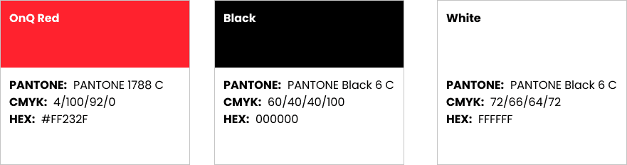
Our primary colors are the visual anchors of the OnQ brand, providing a recognizable and cohesive identity across all company touchpoints. These colors should be used in our core branding elements, such as the logo, official documents, and digital interfaces. The primary palette reflects the values and personality of OnQ, ensuring a consistent look and feel across all applications.
Secondary Colors

Our secondary color palette supports the primary colors, adding depth and flexibility to our brand expression. These colors can be used for marketing materials, presentations, and any creative outputs that require a complementary visual impact. While the secondary colors provide diversity in design, they should be applied in a way that harmonizes with our primary palette, enhancing the overall brand aesthetic without overshadowing our core identity.
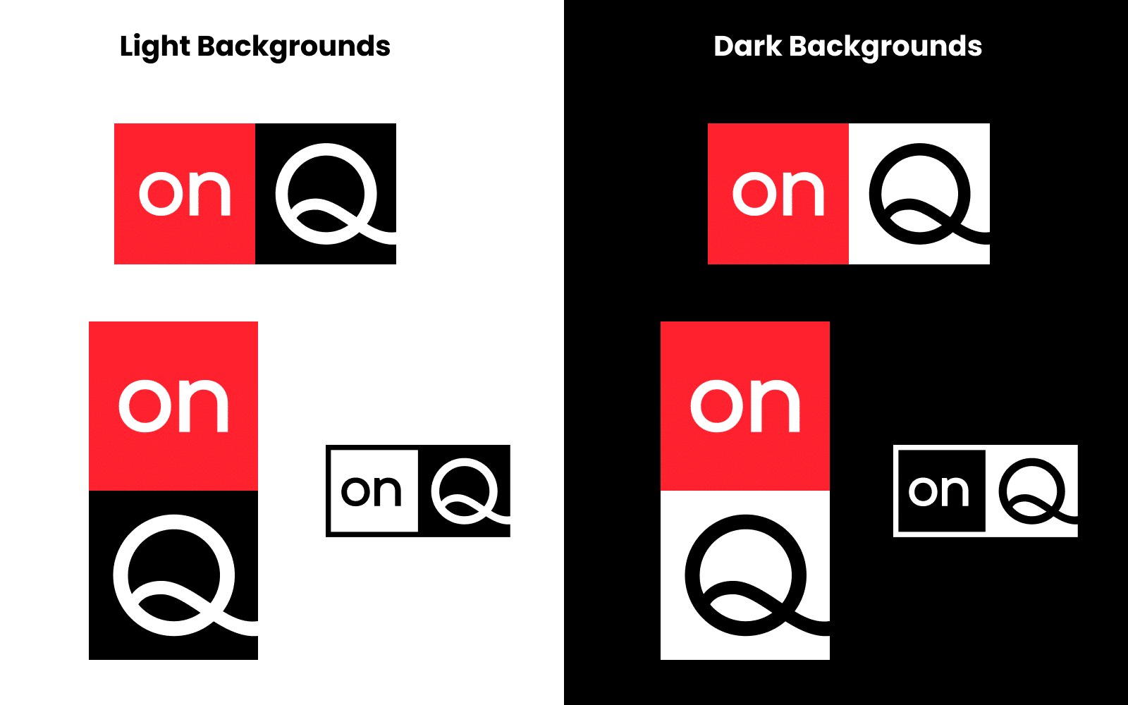
Using our Logo